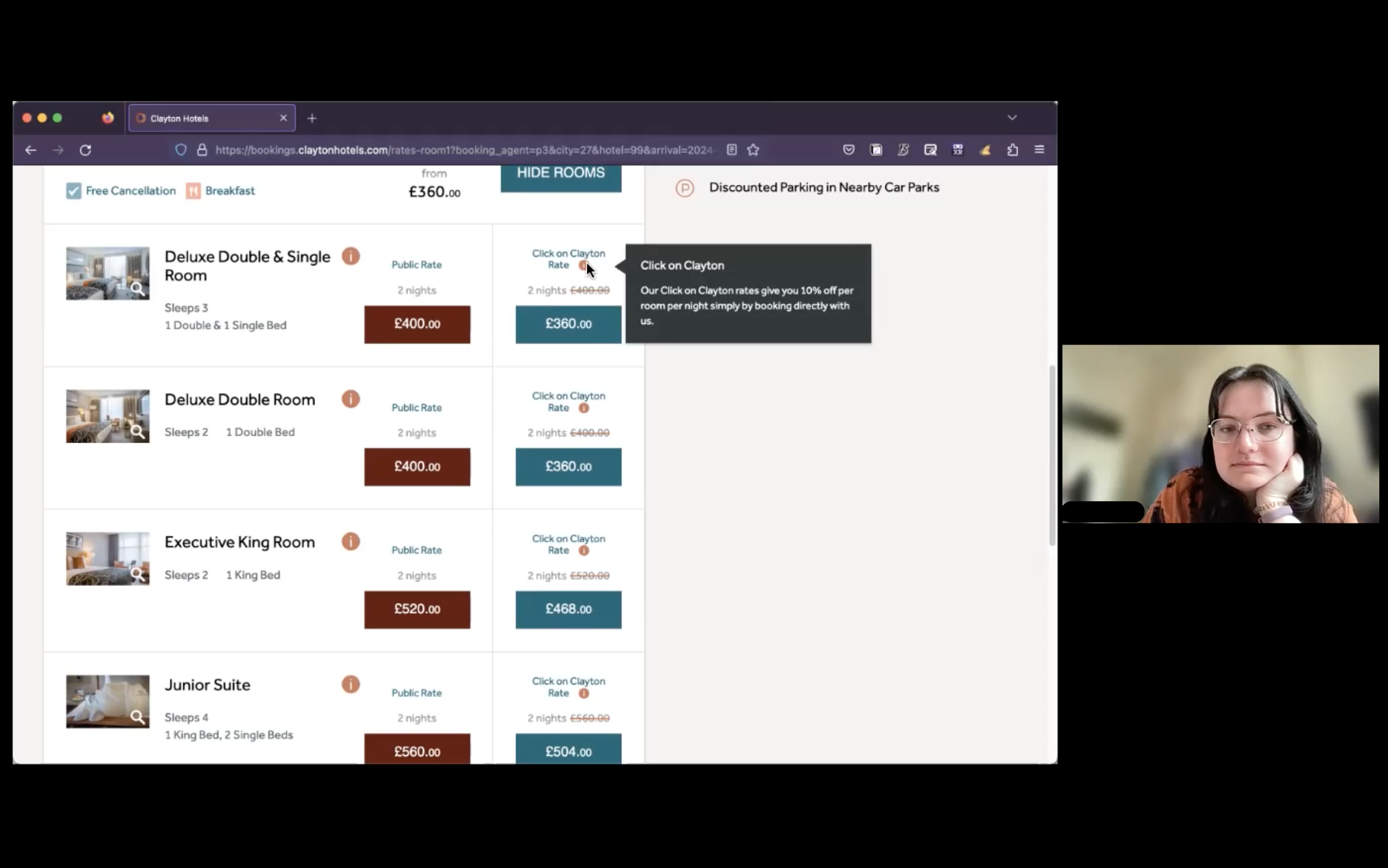
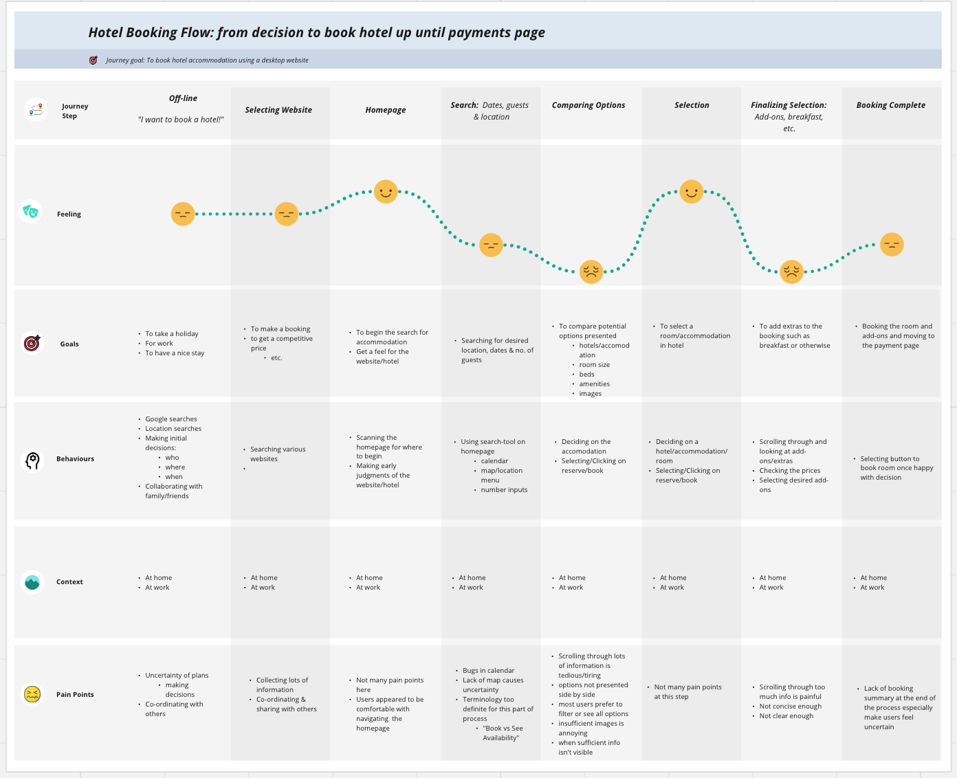
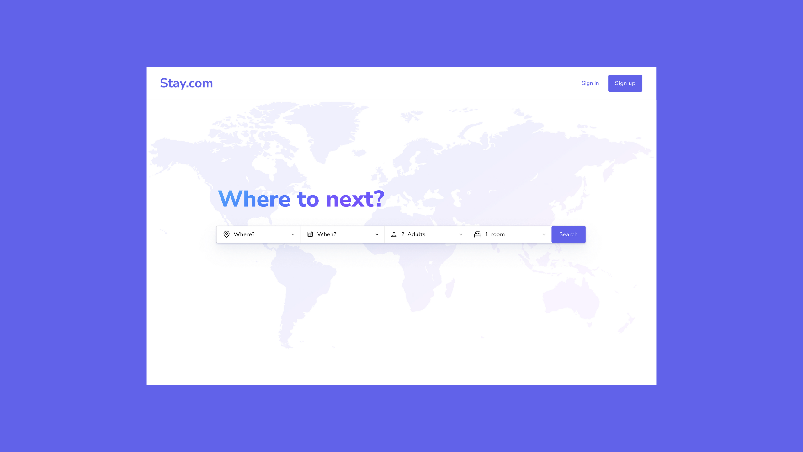
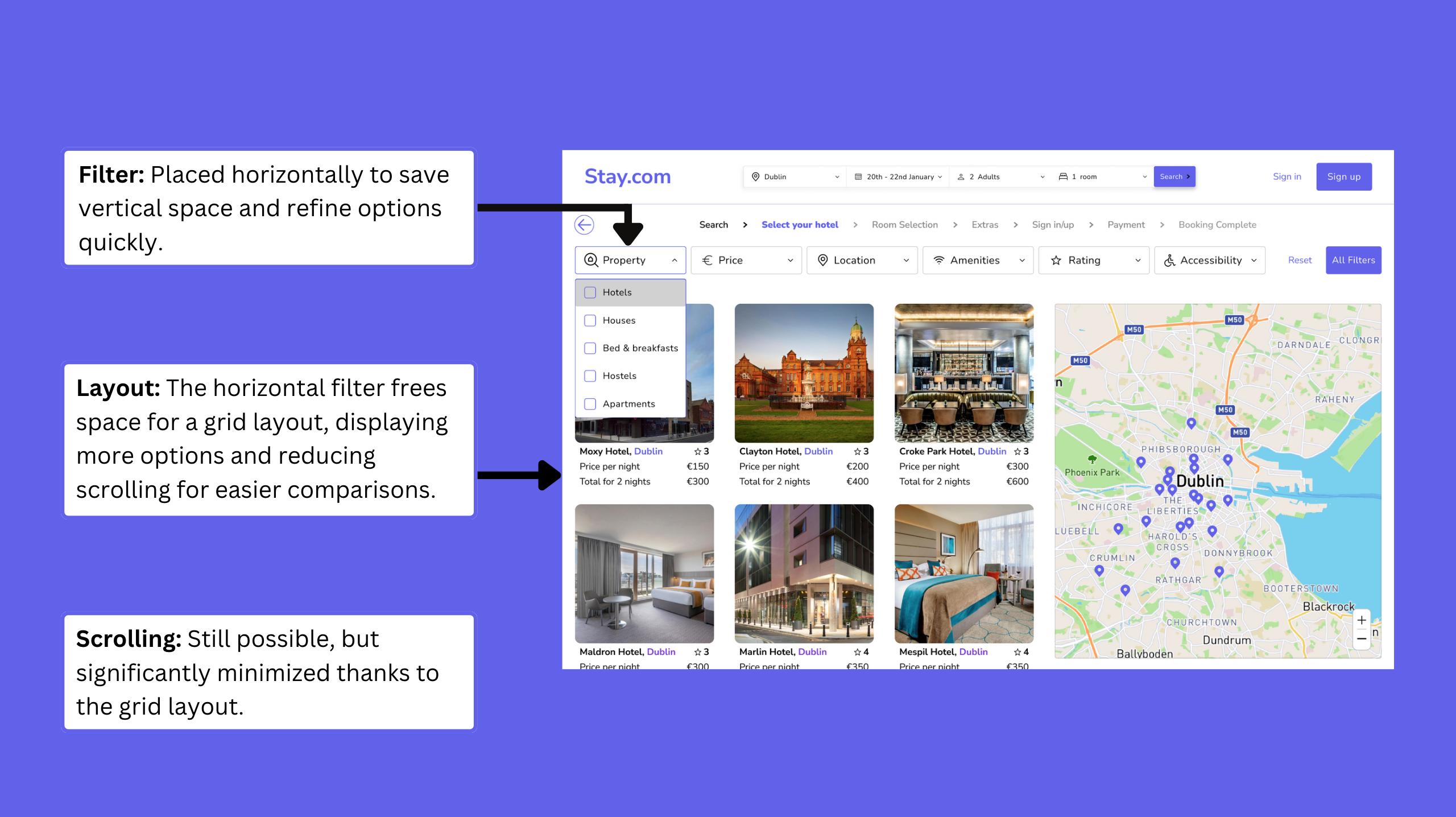
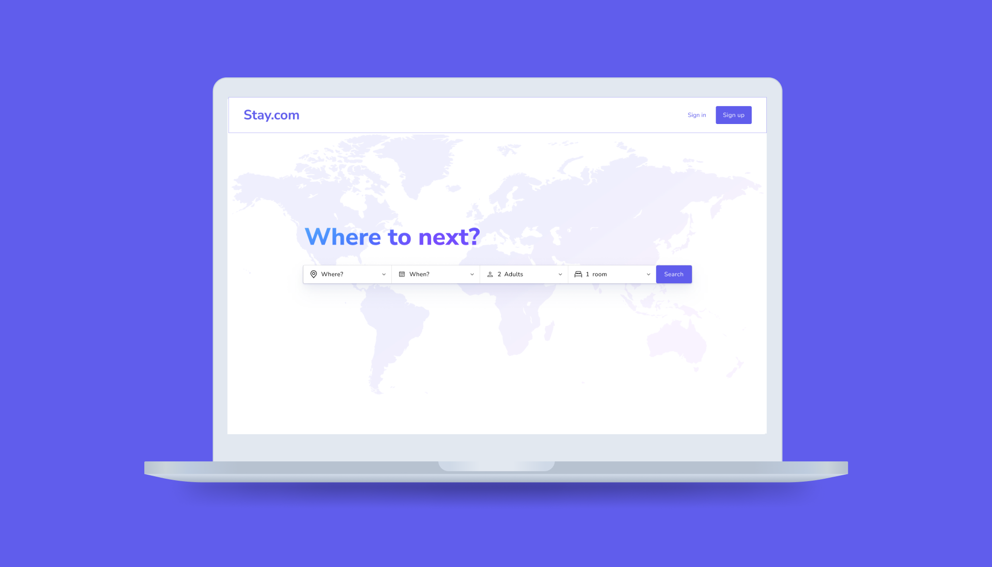
Stay.com

An Enhanced Hotel Booking Platform for Desktop.

A visualization of Stay.com location features

Stay.com is a desktop app developed during my UX Design Professional Diploma, aimed at addressing common user experience issues found in hotel booking platforms.

Stay.com final design homepage
Stay.com: Homepage

The Problem

Many hotel booking websites suffer from poor usability, frustrating users with confusing navigation, unclear information, and inefficient booking processes.

Such issues often lead to user frustration and booking abandonment, signalling a need for a solution that balances functionality with user satisfaction.

Visualization of the usability problems in hotel booking sites

The Goal

The goal was to create a website that prioritises intuitive design, clarity, and efficiency, delivering a smoother and more pleasant booking experience.

The aim was to address these user frustrations with a user-centred, research-driven design process that would reduce abandonment rates and improve user satisfaction.

The Process

To identify key issues, I conducted user research through competitive benchmarking, surveys, and user testing. The data was synthesised into six key issues through an analysis that included affinity mapping and customer journey mapping.

Early design concepts were explored with user flow diagrams and low-fidelity sketches, leading to a high-fidelity interactive prototype in Figma. This prototype was tested for effectiveness, and several points for further development were identified.

The design process diagram

Research

Approach and Methods

To ensure credible findings, I applied triangulation—combining competitive benchmarking, user surveys, interviews, and usability testing. This approach helped identify patterns and insights, grounding design decisions in comprehensive research.

Competitive Benchmarking Online Survey User Testing

Analysis

Techniques and Findings

Using tools such as affinity mapping and customer journey maps, I synthesised the research data into six key insights that guided the design direction.

Affinity Map Customer Journey Map

Key Findings: Primary Design Requirements

The design should aim to fulfil the following objectives:

1.

Interface Design

Busy interfaces with poor readability frustrated users and increased cognitive load.

2.

Flow Design

Users frequently experienced disjointed flows, leading to restarts and premature decisions.

3.

Search Features

Buggy calendars and difficulties finding hotel locations made search tasks cumbersome.

4.

Option Comparison

Excessive scrolling and information overload prevented users from effectively comparing hotels.

5.

Adding Extras

Unclear descriptions, confusing pricing, and inconsistent options created friction when adding extras.

6.

Booking Completion

The lack of transparency in the final booking steps created uncertainty for users.

Design

Design Goals

To directly address the user frustrations identified in research, I set the following goals:

1.

Simplified Interface

Improve readability by minimising clutter and enhancing clarity.

2.

Flexible Flow

Ensure a smoother, forgiving booking journey.

3.

Enhanced Search

Implement reliable calendar and map features to streamline searches.

4.

Streamlined Comparison

Reduce scrolling with effective filters and layouts.

5.

Optimised Extras Selection

Provide clear descriptions, transparent pricing, and consistency in extras.

6.

Transparent Booking Completion

Ensure a clear, summarised final step for user confirmation.

User Flow Diagram

To refine the booking path, I created a user flow diagram that highlighted potential points of confusion and allowed for quick iterations.

User Flow Diagram
Sketches

Sketches

To quickly visualise the booking flow, user interface, and layout, I began with low-fidelity sketches. These sketches identified potential issues, helped refine the design early and formed the basis for the final design/prototype.

Prototyping

After refining the design through sketches and user flow diagrams, I created a high-fidelity interactive prototype in Figma for evaluative testing.

Click on the image below to interact with the prototype in Figma.

Figma Prototype
Prototype: Homepage

Design Solutions Breakdown

Streamlined Interface Design

I designed a simplified interface that prioritises key booking elements, reducing cognitive load and allowing users to focus on essential tasks.

Streamlined interface design with minimal distractions

Optimised Flow Design with Progressive Disclosure

The booking flow uses progressive disclosure, guiding users step-by-step. Breadcrumb navigation helps users track progress and backtrack easily.

Optimized booking flow design with breadcrumb navigation

Enhanced Search Functionality

The calendar and map integrate familiar elements to make searches intuitive. The interactive calendar gives real-time feedback, and the map updates dynamically with hotel options.

Improved search functionality with interactive calendar and map

Improved Option Comparison

A horizontal filter bar was introduced, allowing more space for a grid layout to display hotel options, reducing scrolling.

Improved option comparison with filter bar and grid layout

Clearer Addition of Extras

A dedicated extras modal offers clear descriptions, pricing, and a dynamic booking summary that updates as extras are added or removed.

Clear extras modal with dynamic pricing updates

Improved Booking Completion Transparency

A detailed booking summary lets users review selections before confirming, with editable fields for last-minute adjustments.

Final booking summary with editable fields for last-minute changes

Evaluative Testing

User Feedback

I conducted user tests to evaluate design effectiveness, having users complete a hotel booking in the prototype. The following summarises the findings:

1.

Interface Design

Users found the design clean, but text size was occasionally too small.

2.

Flow

Smooth overall; breadcrumb navigation seemed to have minimal impact.

3.

Search

Calendar was smooth, but map needed slight refinement.

4.

Option Comparison

Effective, though users wanted more overview information.

5.

Adding Extras

Clear navigation, but checkboxes were sometimes confusing.

6.

Booking Completion

Satisfactory, but larger text was preferred.

Further Development

Further Development

Based on user feedback, I identified several key areas for future improvement:

1.

Increase Text Size

Increase text size in key areas for better readability.

2.

Provide Overview Information

Provide more overview information to reduce uncertainty during option comparison.

3.

Breadcrumb Navigation

Ensure breadcrumb navigation is consistent across all booking stages.

4.

Refine Map Functionality

Refine map functionality for smoother interaction.

5.

Clarify Checkboxes

Clarify the purpose of checkboxes in the extras window to reduce confusion.